
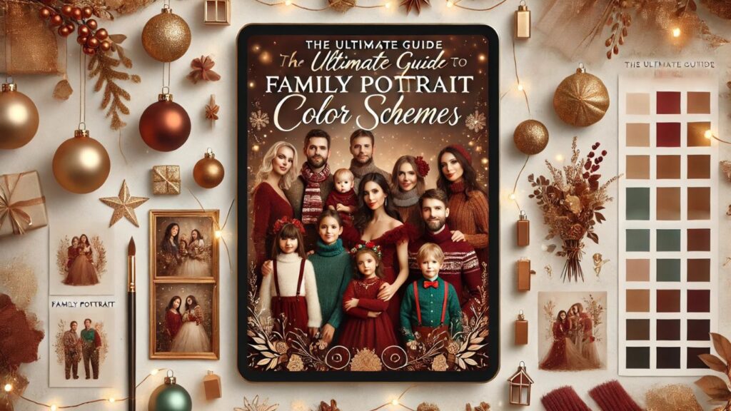
The Ultimate Guide to Family Portrait Color Schemes

Introduction
A family portrait is more than just a photo; it’s a cherished memory that captures love, connection, and togetherness. One of the most crucial elements that can elevate the beauty of your family pictures is selecting the right family portrait color schemes. Choosing a well-coordinated color palette ensures harmony, enhances the visual appeal, and makes the image timeless.
In this detailed guide, we’ll cover everything you need to know about family portrait color schemes, including outfit coordination tips, seasonal ideas, and answers to frequently asked questions. Whether you want a modern, rustic, or classic look, this guide will help you make the best choice for your next family photoshoot.
Why Family Portrait Color Schemes Matter

Creates a Cohesive Look
Well-planned color schemes make the family members look connected rather than mismatched. A balanced color palette brings unity to the photo, making each person stand out while still blending harmoniously.
Enhances the Background
The right colors will compliment your photo location and improve visual appeal. Whether you’re shooting in a natural setting, an urban area, or a studio, choosing colors that harmonize with the surroundings will elevate the overall aesthetic.
Ensures Timeless Appeal
A classic color palette will look elegant even decades later. While trends come and go, neutral and well-balanced color schemes will remain stylish, ensuring your photos always look fresh and modern.
Highlights Emotions
Different colors evoke different moods—warm hues create a cozy feel, while cool tones add sophistication. Soft pastels can give a gentle, airy look, while deeper tones create a rich and dramatic effect.
How to Choose the Best Family Portrait Color Schemes
Consider the Season
The time of year plays a significant role in selecting your color palette. Here’s a seasonal breakdown:
Spring Color Schemes
Soft pastels like blush pink, light blue, lavender, and mint green work beautifully with blooming flowers and fresh greenery. Pair neutrals like beige or white for a soft, dreamy look.
Summer Color Schemes
Vibrant yet balanced shades such as turquoise, coral, mustard yellow, and white complement the bright, sunny environment. Crisp whites and light khakis also work well for beach or outdoor settings.
Fall Color Schemes
Earthy tones like rust, mustard, olive green, and burgundy blend well with autumn foliage, creating a warm and cozy feel. Deep navy, brown, and burnt orange add warmth and depth.
Winter Color Schemes
Classic and sophisticated hues such as deep reds, navy blue, forest green, and neutrals like cream and gray suit snowy backdrops. Metallics like silver and gold can add elegance and festivity.
Keep It Simple with a Limited Palette
Too many colors can create visual chaos. Stick to 3–4 complementary shades for a balanced and polished look. A mix of neutrals with one or two accent colors often works best.
Match with the Background and Location
Your chosen setting should influence your color scheme:
- Beach Setting: Soft blues, whites, and sandy neutrals work well.
- Park or Forest: Earthy greens, browns, and muted warm tones blend beautifully.
- Urban or Cityscape: Bold colors like deep reds, mustard, or monochromatic tones add a modern touch.
- Indoor Studio: Muted neutrals and pastels ensure a clean, classic look.
Opt for Timeless Colors Over Trends
Trendy colors may look stylish now but can quickly become outdated. Instead, opt for classic and flattering shades like beige, navy, white, or soft pastels for a look that remains stylish for years.
Balance Solid Colors with Subtle Patterns
While solid colors create a sleek and cohesive look, incorporating subtle patterns like florals, plaids, or stripes can add depth and character to your outfits. Just ensure patterns don’t clash.
Family Outfit Coordination Tips
Start with One Outfit and Build Around It
Pick one key outfit (often mom’s or a child’s outfit) and coordinate the rest of the family’s attire around it using complementary colors.
Avoid Identical Matching
Instead of dressing everyone in the exact same color, mix different shades of the same color family. This approach looks more natural and visually interesting.
Layering Adds Depth
Adding layers such as jackets, cardigans, scarves, or vests can enhance texture and dimension in photos, making the portraits more visually engaging.
Dress for Comfort and Movement
Ensure outfits allow for easy movement, especially for kids. Avoid stiff clothing that may feel restrictive.
Coordinate Footwear
Footwear is often overlooked but should align with the overall theme. Avoid athletic sneakers unless they fit the setting.
Family Portrait Color Schemes by Style
Classic and Neutral
Colors: White, beige, cream, taupe, navy
Best For: Timeless, elegant, and sophisticated portraits
Rustic and Earthy
Colors: Mustard yellow, rust, olive green, brown, tan
Best For: Fall or countryside settings
Bold and Vibrant
Colors: Red, mustard, teal, deep purple
Best For: Fun and lively outdoor portraits
Soft and Romantic
Colors: Blush pink, light gray, lavender, soft blue
Best For: Dreamy and pastel-themed shoots
Modern Monochrome
Colors: Various shades of gray, black, and white
Best For: Contemporary and sleek portrait styles
Common Mistakes to Avoid

Overdoing Accessories
Keep accessories minimal so they don’t overwhelm the outfits.
Clashing Patterns
If using patterns, ensure they are subtle and don’t overpower the overall look.
Ignoring the Environment
Make sure your color choices blend harmoniously with the background.
Wearing Logos or Graphics
Avoid branded t-shirts and large logos, as they can be distracting.
Choosing Unflattering Colors
Some colors may not suit all skin tones—test outfits beforehand.
Frequently Asked Questions
What colors should you not wear in family photos?
Avoid neon shades, bright oranges, and extremely dark blacks, as they can be overpowering or cause harsh contrasts in photos.
How do you coordinate family outfits without being too matchy?
Choose 3-4 colors from a single color palette, mix patterns subtly, and vary shades within the same color family.
Can I wear all-white outfits for a family portrait?
Yes, but ensure there’s enough texture and layering to add depth and dimension to the photo.
Do darker colors make you look slimmer in photos?
Yes, deep hues like navy, black, and deep greens create a slimming effect.
How do you make family photos look timeless?
Stick to neutral and classic colors, avoid trendy outfits, and focus on natural, flattering tones.
Conclusion
Selecting the right family portrait color schemes is key to creating a stunning and timeless family photo. By considering the season, background, and overall aesthetic, you can ensure your portraits look cohesive, stylish, and visually appealing. Planning ahead and sticking to a limited, complementary color palette will enhance the overall impact of your family portraits, making them cherished memories for years to come.
CLICK FOR MORE INFORMATION Dailynewsbizz.com